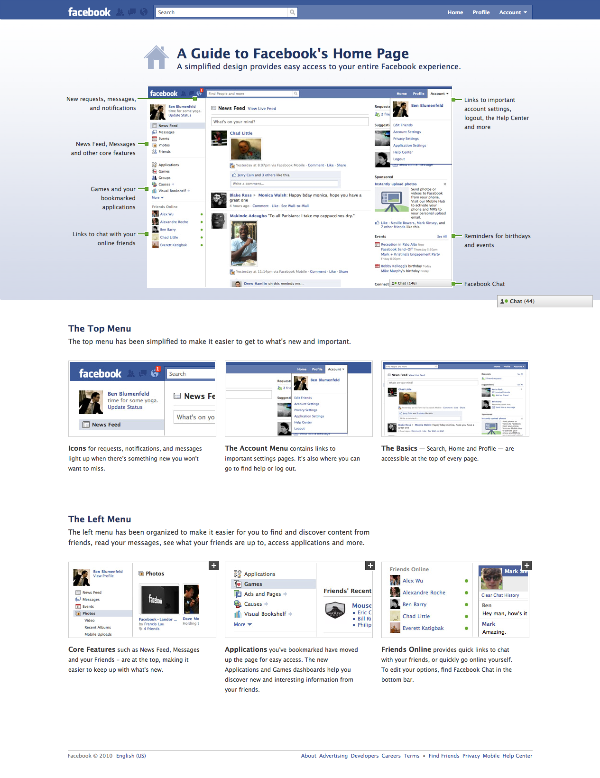
The social networking juggernaut yesterday celebrated its sixth birthday and impressive milestone of reaching 400 million registered users this week. What’s more titillating is that Facebook has already rolled out a major revamp of its home page to 80 million users all over the world, and it appears that the gist of the redesign is on simplicity. It places a new emphasis on search, with features that help you find what you are looking for on Facebook without any much hassle. For example, the top menu has been simplified to make it easier to get to what’s fresh and important. The notification bar, which was located at the bottom right hand corner of the page, has been moved to the top menu section alongside with the more prominently placed search bar.
I haven’t gotten gotten the new user-interface yet but from the screenshots taken by lucky users suggest that the folks over at Facebook have done a “pretty good job” and I personally love the redesign. Hopefully, Mark Zukerburg and Co. will continue to work on the privacy issues and reduce the amount of spam (Farmville, Click Here To Donate To The Victims In Haiti, etc.) on the home page.
*Click on the image below to view the larger version
Via Eric Stoller
