With over 54 million users worldwide and close to 7 billion tweets being posted, Twitter is the world’s most popular micro-blogging platform, fueled by smartphones and online bursts of 140 characters. 2009 is the year of Twitter. It soared to lofty heights over the past year, all thanks to the active presence of celebrities such as Ashton Kutcher and Oprah Winfrey. The San Francisco-based Internet company isn’t a social networking website like Facebook or MySpace. Instead, the main focus of Twitter is about real-time information of the things you care about — work, industry, company, news.
2010 will be the revenue year of Twitter. The micro-blogging juggernaut will focus on generating revenue in the year ahead, and may explore options including an initial public offering. “2010 is really going to be the revenue year. I don’t know if we’re going to be profitable, but we have plenty of time,” said co-founder and creative director Biz Stone during an Oxford University event in November.
Today, I’d like to share with you guys ‘7 Creative and Interesting Infographics about Twitter‘. Enjoy and don’t forget to tweet about this post! 😀
Timon Singh from NGONews has created an infographic which shows the journey of a Tweet and how it evolves from a simple 140-character long message to a Google news story.

Ordinary people use Twitter to share with their friends and co-workers what they are doing; bloggers, Internet marketers, and businesses use Twitter to promote their articles/products; politicians use Twitter to garner support; celebrities use Twitter to stay in touch with their beloved fans, and spammers use Twitter to send unsolicited messages.
Inspired by Guy Kawasaki, “The Many Users of Twitter” is an infographic designed by the folks at NGONews. According to Guy Kawasaki, there are six types of Twitter users – Newbie, Brand, Smore, Bitch, Maven, and Mensch. So which one are you?

3. Information creation and circulation before and after Twitter
Designed by Burson Marsteller, the “before Twitter” infographic shows that time is necessary for the information to spread before its arrival on Twitter. On the other hand, the “after Twitter” infographic reveals the changes of the information circulation with the development of the use of Twitter.
Before Twitter

After Twitter

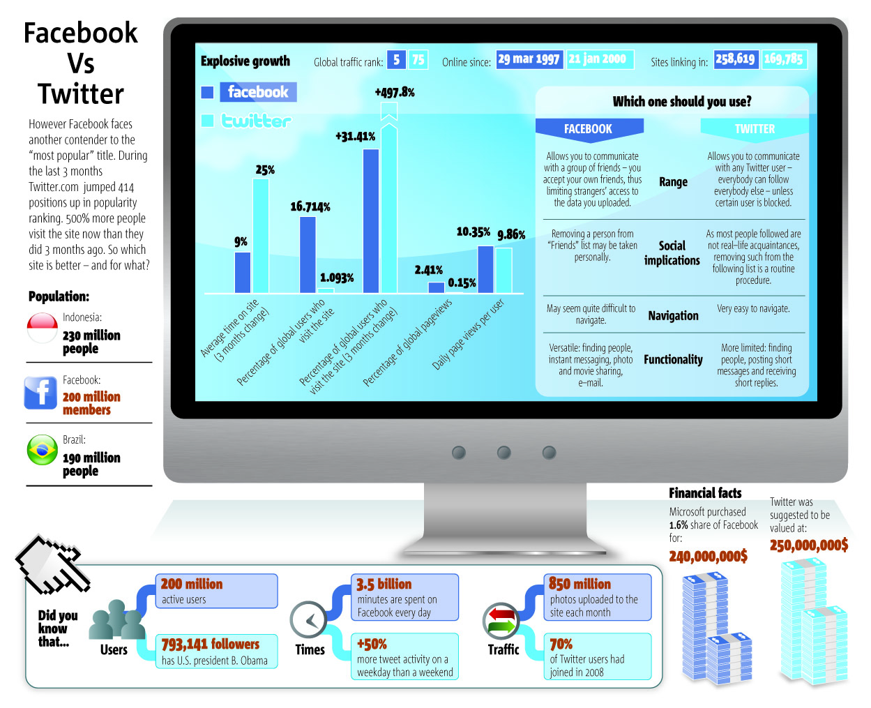
Although one is a social networking websites whereas the other is a micro-blogging platform, but both have been ruled as “arch-rivals”. The “Facebook VS Twitter” infographic depicts the exponential growth of the two websites.
*The statistics are outdated, but at least it’s worth taking a look.
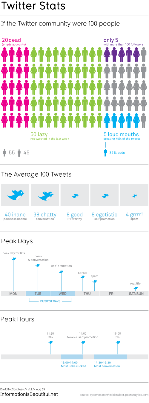
5. More Truth About Twitter – Twitter Stats
Based on surveys and statistics, InformationIsBeautiful has designed an infographic that shows the percentage of active and non-active Twitter users; the number of people out of 100 whose tweets are pointless babble, and when are the peak days and hours.
6. The History of Twitter, So Far
In July, we gathered information from various sources and compiled the list of “The History of Twitter in pictures“.
However, Manolith has done a better job in telling the story of Twitter by squeezing a long-form blog post into an attractive infographic that puts some key moments of the service’s history in visual form.

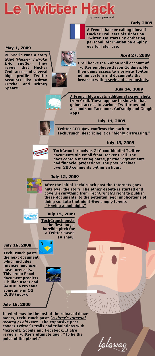
Apparently, Twitter needs better security. The “Le Twitter Hack” infographic shows a timeline of events regarding the July’s Twitter attack.